
A page doesn’t rank, persuade or build trust as a Word document. It does that as a live experience.
So when SEO-optimised copy gets signed off, the job isn’t finished. That’s the point where the strategy becomes real or comes undone, and it comes undone more often than the industry likes to admit.
Somewhere along the way, SEO content put on a grey tracksuit: H1. Paragraph. H2. Paragraph. A few internal links. A flat FAQ block at the bottom. Technically optimised. Emotionally abandoned.
I spend my days on the other side of that content handover, building optimised content into live client sites, and I’ve watched the part everyone treats as admin become the part that decides whether the page works.
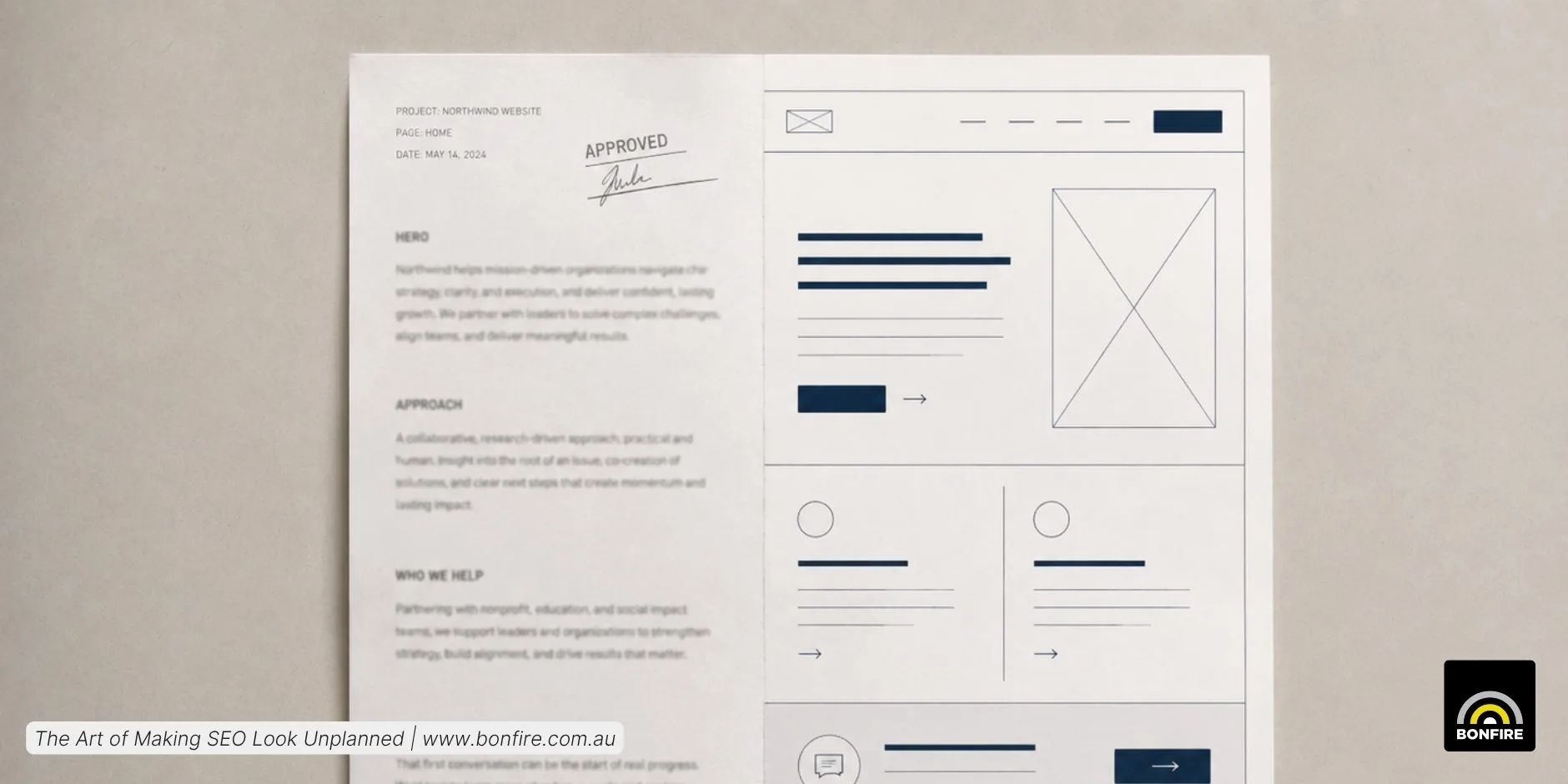
The same approved copy, two outcomes. The page it becomes is where the strategy either lands or leaks away.
The upload stopped being admin
Uploading content used to sound like the easy part of the job. Take the approved copy, log into the CMS, add the headings, paste the body, press update. That still happens in some corners of the industry, and it badly undersells what an SEO page has to do now.
Modern optimised content has to answer the search intent. It also has to support the brand, hold attention, build trust, guide action, work on mobile, make sense to search engines, and increasingly be clear enough for AI systems to read and cite. A well-written service page can still underperform when it’s dropped into a weak layout. Dense paragraphs bury the best answer. A strong proof point loses its force in the wrong place. A useful FAQ goes unread when it looks like a wall of text.
Our content writers at Bonfire are in-house and Australian-based, which keeps the feedback loop tight. Strategy, writing, uploading and performance aren’t separate planets here. They talk to each other, and that conversation is where my view of the work formed.
From approved copy to page architecture
Our content recommendations have stopped reading like “add this text to the page”. They read like page architecture. This section works better as a two-column explainer. This proof point belongs beside the CTA. This FAQ should be an accordion. This comparison earns its place as a table. A small change in wording, but a large one in thinking. We’ve stopped asking what content goes on a page and started asking what the page should become.
We’ve stopped asking what content goes on a page and started asking what the page should become.
The CMS rarely gets to be the excuse. We work across WordPress, Elementor, Shopify, Squarespace, Drupal, Adobe Commerce, custom builds and plenty of more restrictive systems. The goal is to learn what a platform can do, then stretch it without breaking the design system or creating a maintenance headache, instead of forcing every client into one layout.
Sometimes that means leaning into existing modules or a template. Sometimes it means restraint. Because a page buried in visual, SEO-optimised clutter isn’t better than a plain one. But a page that uses structure with intent helps people scan, compare and act faster.
People-first content needs people-first formatting
Real users don’t read in order. They skim. They compare. They look for reassurance and scroll past anything generic. Good structure gives us ways to meet them.
- A CTA placed after a key benefit lands when interest is highest.
- A comparison table cuts decision fatigue.
- A Google Maps embed makes a location page instantly more useful.
- An FAQ accordion gives hesitant readers control over how much detail they want.
This is also where E-E-A-T — Experience, Expertise, Authoritativeness and Trustworthiness — stops being an acronym in a meeting and starts being something the page does.
Experience shows through specific examples and local context. Expertise shows through clear service detail and accurate terminology. Trustworthiness shows through real team information, transparent contact paths and content that doesn’t overpromise. Good structure brings those signals to the surface instead of hoping the reader notices them.
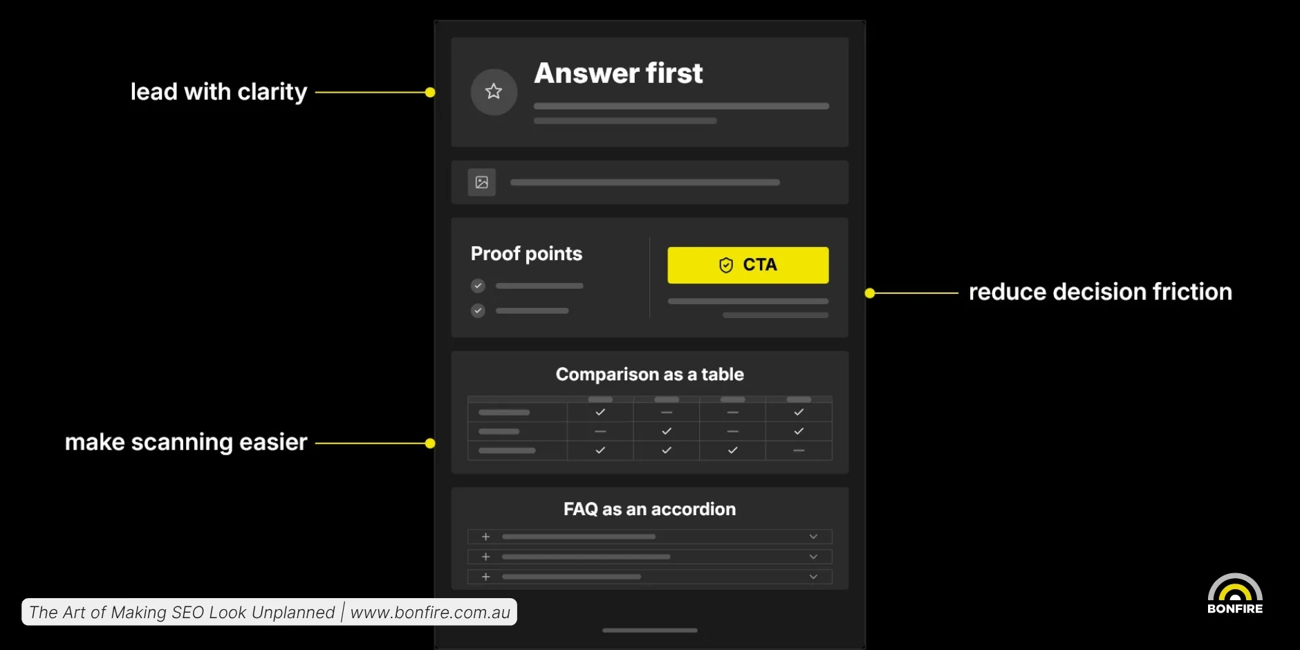
A people-first page is planned block by block, so the reader who skims still lands on the answer.
FAQs are the clearest example. For years they were treated as a search-result play: add questions, add schema, hope for more space on the results page. Google has since discontinued FAQ rich results in Search, which retired the decorative reason for adding them. It didn’t retire the usefulness reason though. A good FAQ still reduces hesitation, answers the awkward question a buyer won’t phone to ask, and feeds the clear answers AI systems lean on. We add them because the user needs answers, not because we’re chasing a search engine result that no longer shows.
Making it feel native
The highest compliment a build can get isn’t “this is very optimised”. It’s “this feels like it was always here”.
Every site has its own rhythm: button styles, spacing, heading hierarchy and content patterns. The craft is improving the page without making it look like the SEO team stapled a brochure to the bottom of it.
The craft is improving the page without making it look like the SEO team stapled a brochure to the bottom of it.
To do that, we typically match the existing style. Use the components that already exist before inventing new ones. Know when to reach for custom HTML and when to stay inside the CMS toolkit.
Better-built pages are the next SEO advantage
Topic and keyword relevance used to be most of the game. Now content has to be easy to recognise. For users, that means a page that answers the question without making them work for it. For search engines, it means well-organised content with clear signals. For AI systems, it means content structured cleanly enough to summarise and cite with confidence. For brands, it means SEO pages that don’t look like SEO pages.
That’s where our upload process has landed. We build the page around the content it carries, rather than pasting the content onto an existing layout. The distinction sounds small, but it’s the difference between a page that’s merely available online and one that’s built to be found, understood and remembered.